AI-Generated
Graphic Design
WebDesign
Anexo A is a brazilian company focused on industrial automotive metallic parts and their key product are towing coupling for Stellantis, owner of such brands like Jeep, Chrysler, Fiat, Peugeot, Citröen, Maseratti and many more.
The company’s pain was their overall poor web presence and product catalog. Our project is based on a multi-checkpoint strategy, starting with their key product: tow coupling. After discussing the options I presented and what the company needed as priority, I advocated for an online catalog such as a webpage where it would be easier to update content, pictures and technical data, better to control access, and we can make use of multimedia elements. After getting the OK for this asset to be created, I decided to use AI-generated content to squeeze the maximum of our allowed budget and deliver a cinematic hero splash screen.
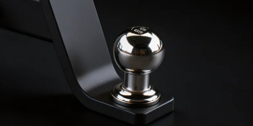
For the product catalog images, I had access to all the product CAD files and then I rendered everything using Luxion’s Keyshot, so we had acurate and beautiful shot of each product, perfectly aligned to camera angles favouring its intricate structure, over a plain neutral background to be used alongside the webpage.
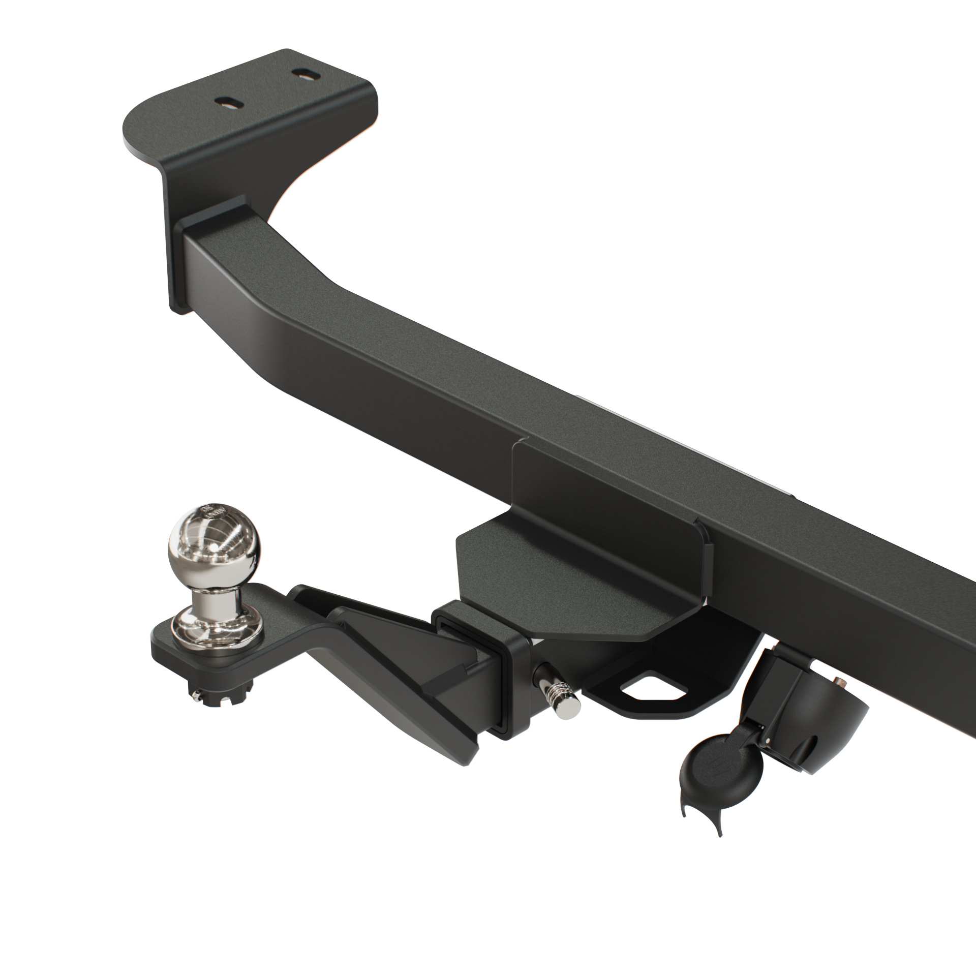
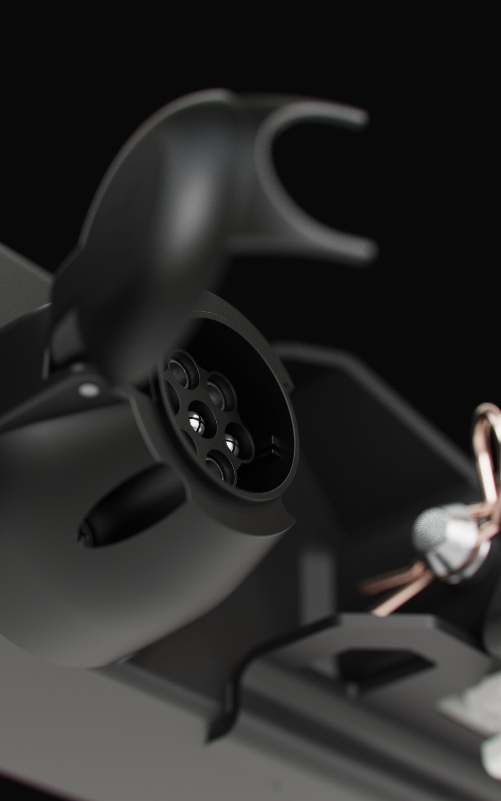
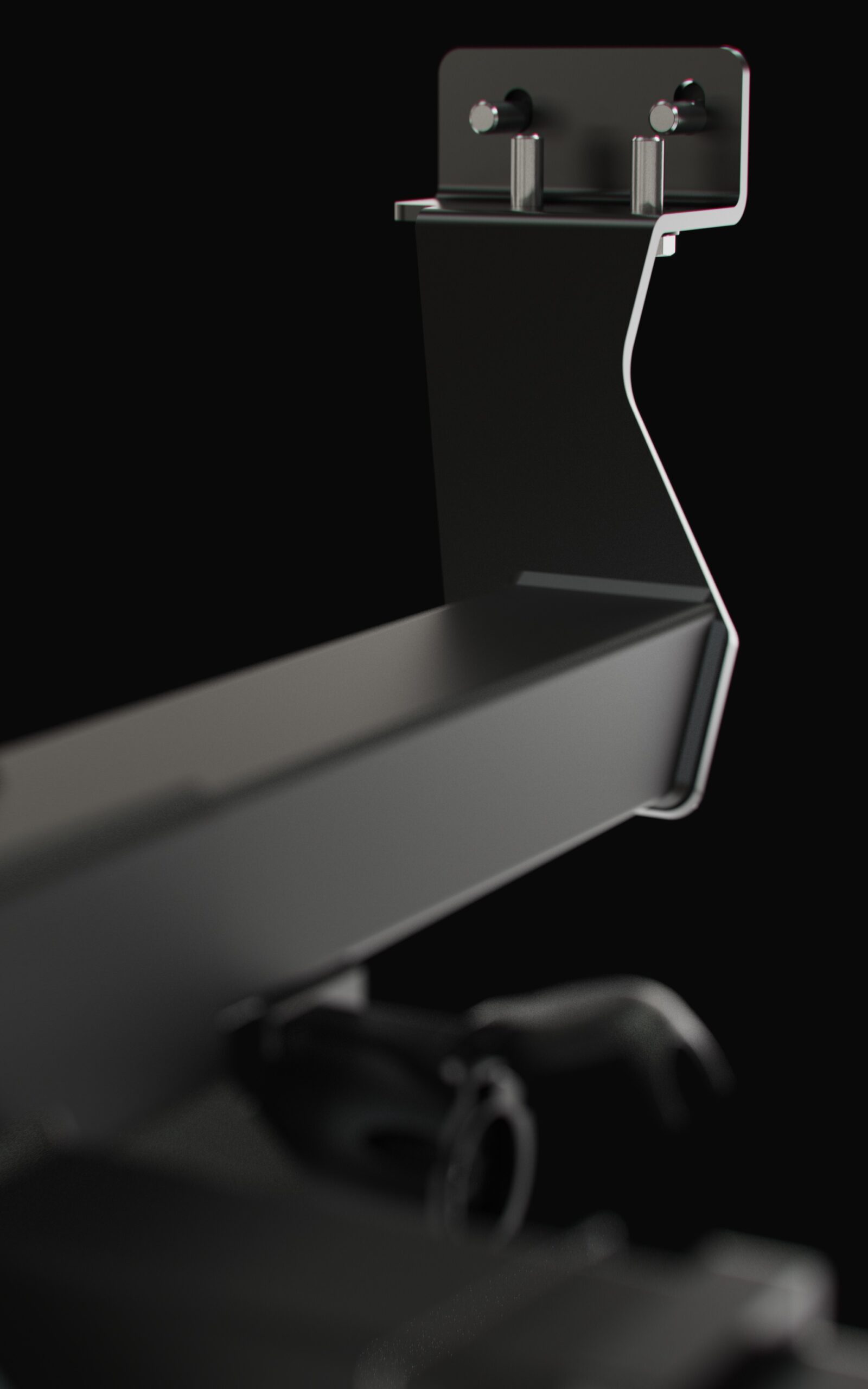
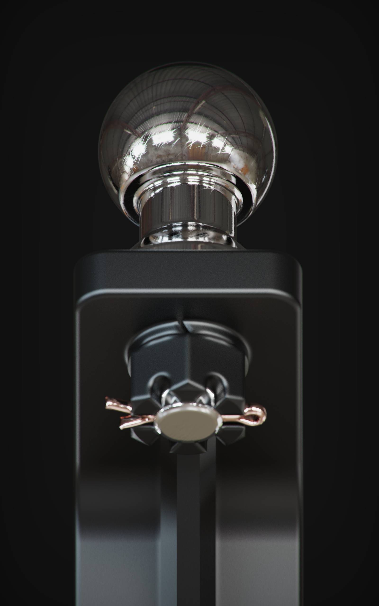
All the products were treated in a 3D environment in order to be textured with the right materials parameters and scale.
I crafted render shots in neutral background color and studio lighting setup to highlight the maximum of each and every detail, giving a premium feel and aesthetics to the product.
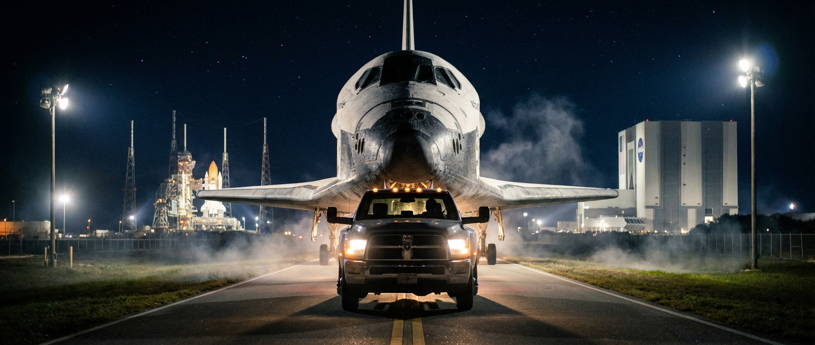
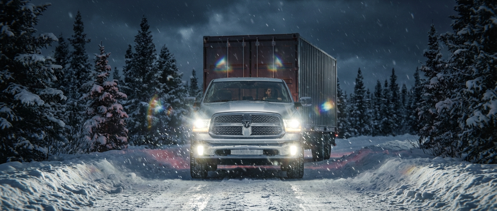
The most impactful section of this online catalog is the cinematic video on the hero section.
Were not for the licensing fees from the 3D software used to render, this could have been the most expensive portion of the project.
In order to get the artistic direction I was seeking, I had to experiment and combine many AI agents together, from scripting the scene direction and photography, to fine tuning the end prompt.
It took weeks between finding the prompt recipe combining real world cameras models and brands, lens types and brands, post-production and in-capture glare effects, plus the training sessions of each vehicle to render and behave accordingly each make and model.
The end result is a stunning cinematic shot compilation with aesthetically light leaks, subtle chromatic aberration and real world dynamics, all later on edited, color corrected and stitched together using Adobe Premiere.
Each vehicle model was curated and trained as a separate LORA or character, then inserted in a meticulously crafted prompt. Not only this steps were necessary to achieve a realistic cinematic video, but I had to experiment with so many different AI models ranging from WAN (all of their available versions), LTX, Higgsfield native, Seedance (both models), Kling 3.0, Minimax Hailuo, the most expensive of all agents SORA and I even experimented with Grok.
All in all, it was a fun process, although a bit costly, certainly cheaper than having it recorded in real life with real vehicles, cameras and personel. Having to wait long minutes between each generation ended up costing myself long nights awake just to change a coma or a word to get better results.
CLIENT
ANEXO A (Brazil)
PROJECT SCOPE
WEBDESIGN
PROMPT ENGINEERING
VIDEO EDITING
SOFTWARE
MAYA
PHOTOSHOP
AFFINITY DESIGNER
PREMIERE PRO
KEYSHOT
HIGGSFIELD
COMFY UI