The Kreiselfest (or Roundabout Festival) in the city of Zollikofen, Switzerland, is a large community festival taking place on the main avenue closing the traffic to host the mega-party for two consecutive days, to happen on 4th and 5th September this year, 2026.
The project is lead by a committee of 40 decision-makers executives that plays a significant role in the city economy. After presenting my brand project’s entry for the event, it was finally awarded as winner and the committee officially adopted this Brand Identity System.
The briefing was clear:
Based on that I designed the main core logo elements and presented five versions with various elements to choose from, including: dog, cat, hot-dog, barbecue on a stick and number pairing variations.
The chosen version is the one with a dancing couple, a cute dog looking to the huge number pairing 2026 hat houses comfortably the city’s name and the provided slogan.
As to the aesthetic, I took inspiration on the Romero Britto’s artwork, a renowned Brazilian abstract painter, now living in Florida, USA.
He defines his own artwork as happiness, has an extensive gallery of random subject paints and prices from his canvas can reach up to US$ 2 million for a single painting.
The vector-like strokes and precise bold lines filled with colorful patterns looks great on digital and printed media, thus, being my first choice to elaborate on the subject.
Although this being a starting point, our Kreiselfest Brand came out with my own point of view, with quite different line design, weight, clear boundaries, cleaner pattern and a technically controlled color palette.
It started with many pencil sketches in my notebook until I found the circle formation with elements inside and typography outside.
Once found the core composition, I designed the shapes in vector software and fine-tune all the measurements and adjustments to balance and fit all the elements.
After that I refined the colors to a limited palette and applied many combination until the most balanced and harmonic was found.
The final approved version was the 15th version and later on including a second logo and a website, the project used about 60 hours of dedicated work, and it is still ongoing. Don’t miss to visit the official Kreiselfest website as well.
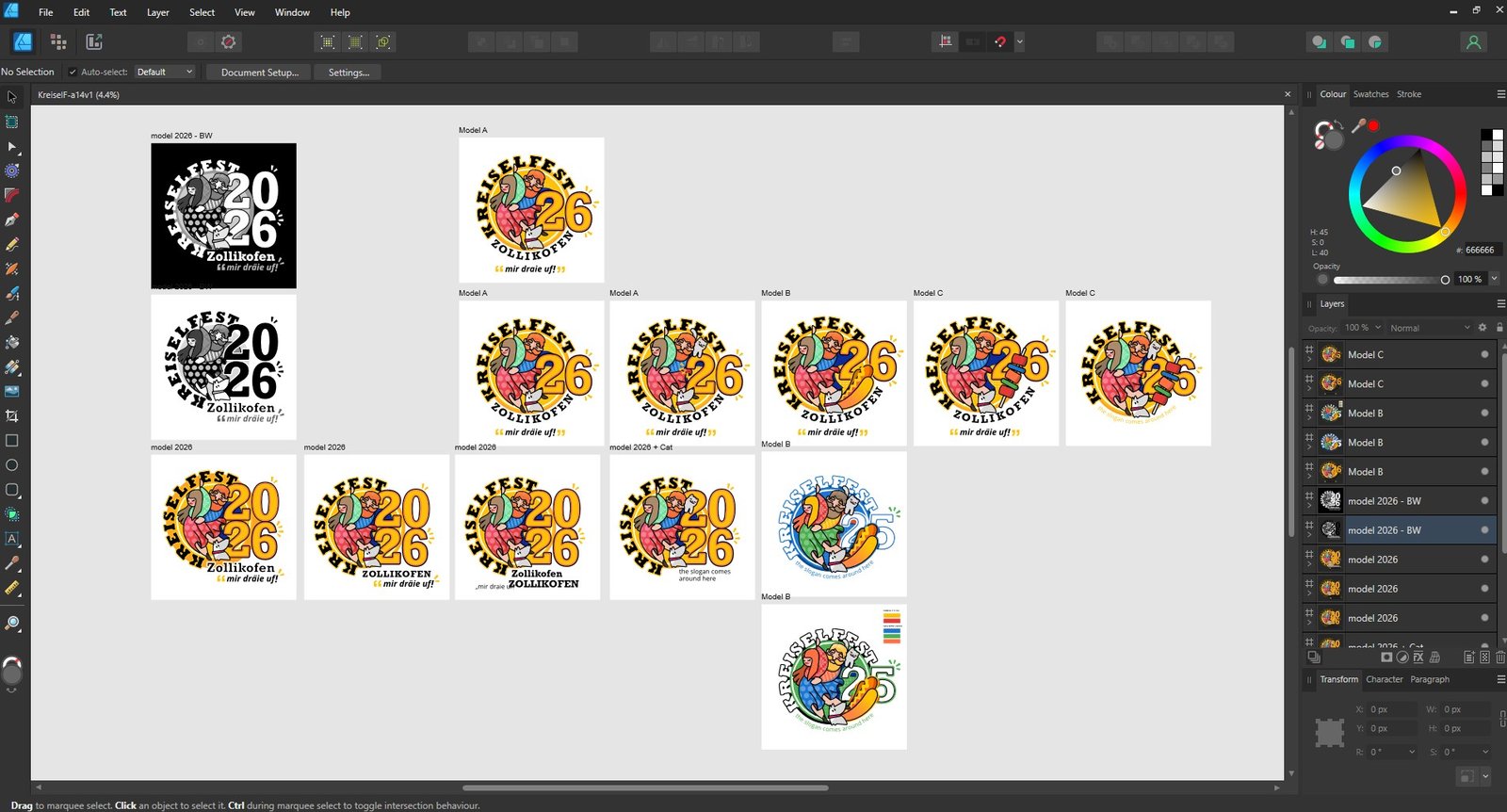
Technically, the logo was a complex puzzle of shapes and patterns, but aesthetically it looked smooth and easy on the eyes.
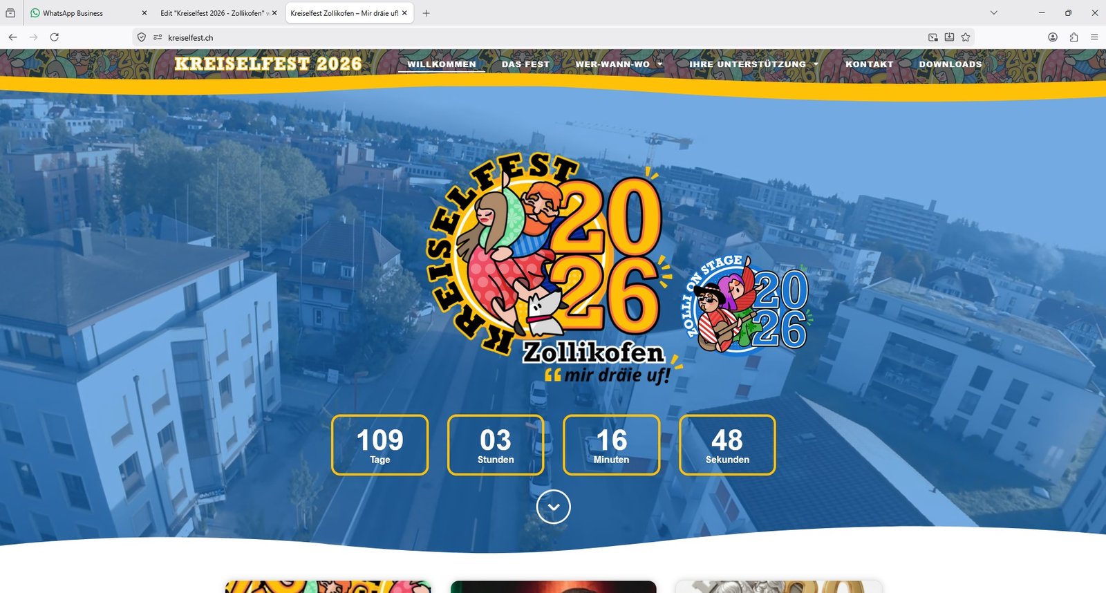
Shortly after the logo was done, I got a request to expand the project to a second logo, this time for the side event, the music festival.
Before diving into the complimentary logo, the next step of the process was to elaborate the brand guidelines and usage, as well as some mock ups with practical examples.
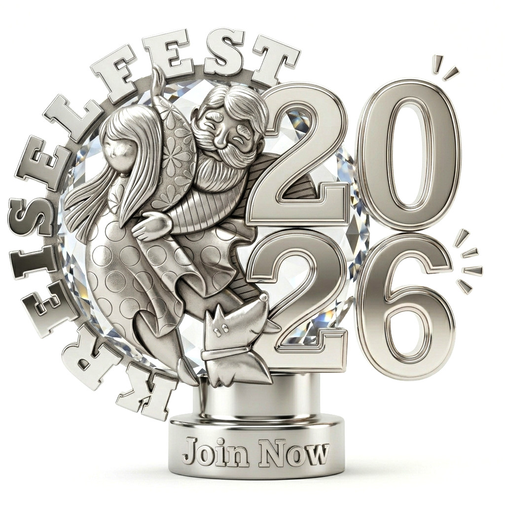
The logo was also built to be modular and ready to be update next and upcoming years. The way I built it, it is quite easy to change 26 to 27 or whatever the year number that the next festival will be held.
But I must admit, if I am to be honored again to manage the brand next festival edition, I would change the main character elements as well, so as the years and festivals goes by, we end up having a collection of logos with diverse characters, creating a world of its own.
The circular logo could face complex fitting into the square world of monitors and framing for printed media. The richness of this logo allows us to truly play around and find joyful compositions.
This was done by isolating the logo in a radial neutral border and filling the background with a mixture of its elements, drawing the eye always to the main element and filling with uplifting vibe all around the composition in a less word and more color approach.
The Music Event named Zolli on Stage was later added to the project and asked to be designed as a “twin” logo approach.
For that I used the existing design system and tweaked the characters to a more explicit sign ( music player, singer, dancer ) and used a rather analog color palette with blue and purple being the main mood contributors as the music event usually tends to happen at night.
For me, personally, the great addition is the red and white striped pattern added to one character element, clearly honoring the Swiss flag colors and pattern seen in many historical buildings.
In the end, the main Kreiselfest logo and the Zolli On Stage logo are a great pair that not only look alike, but complements each other to a greater feeling of the event.