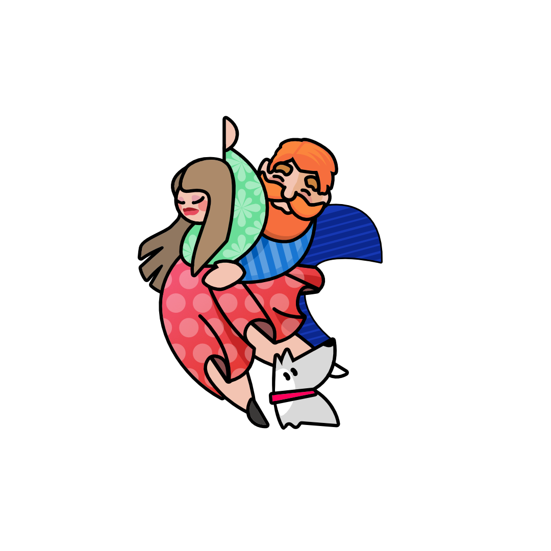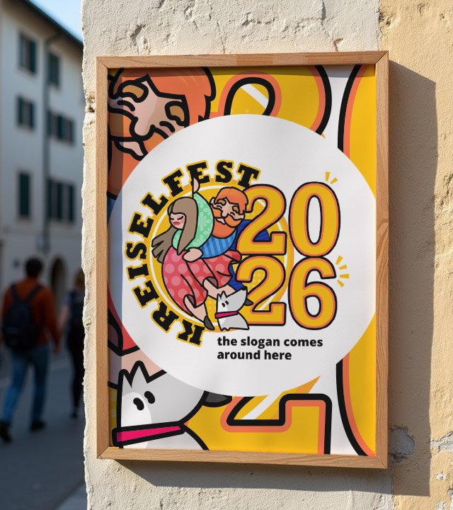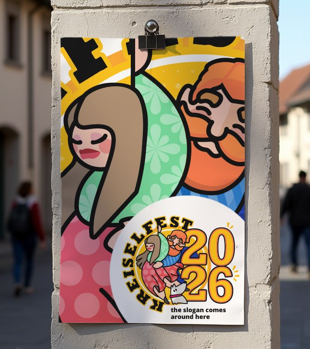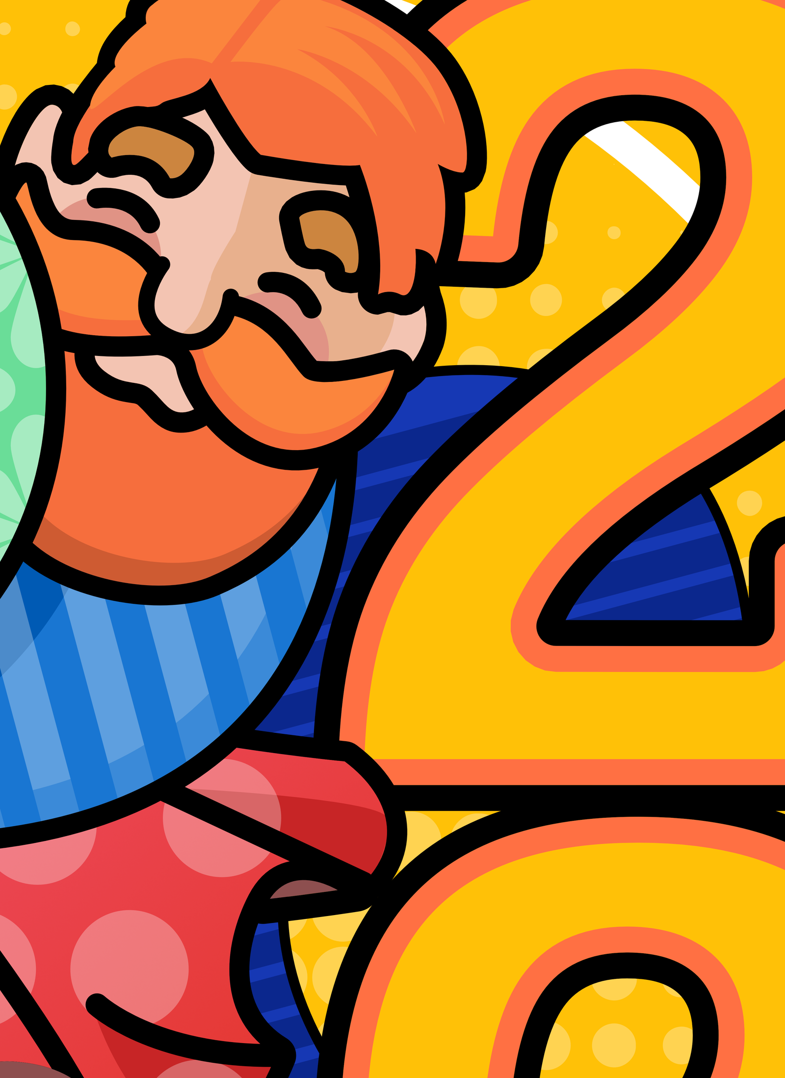


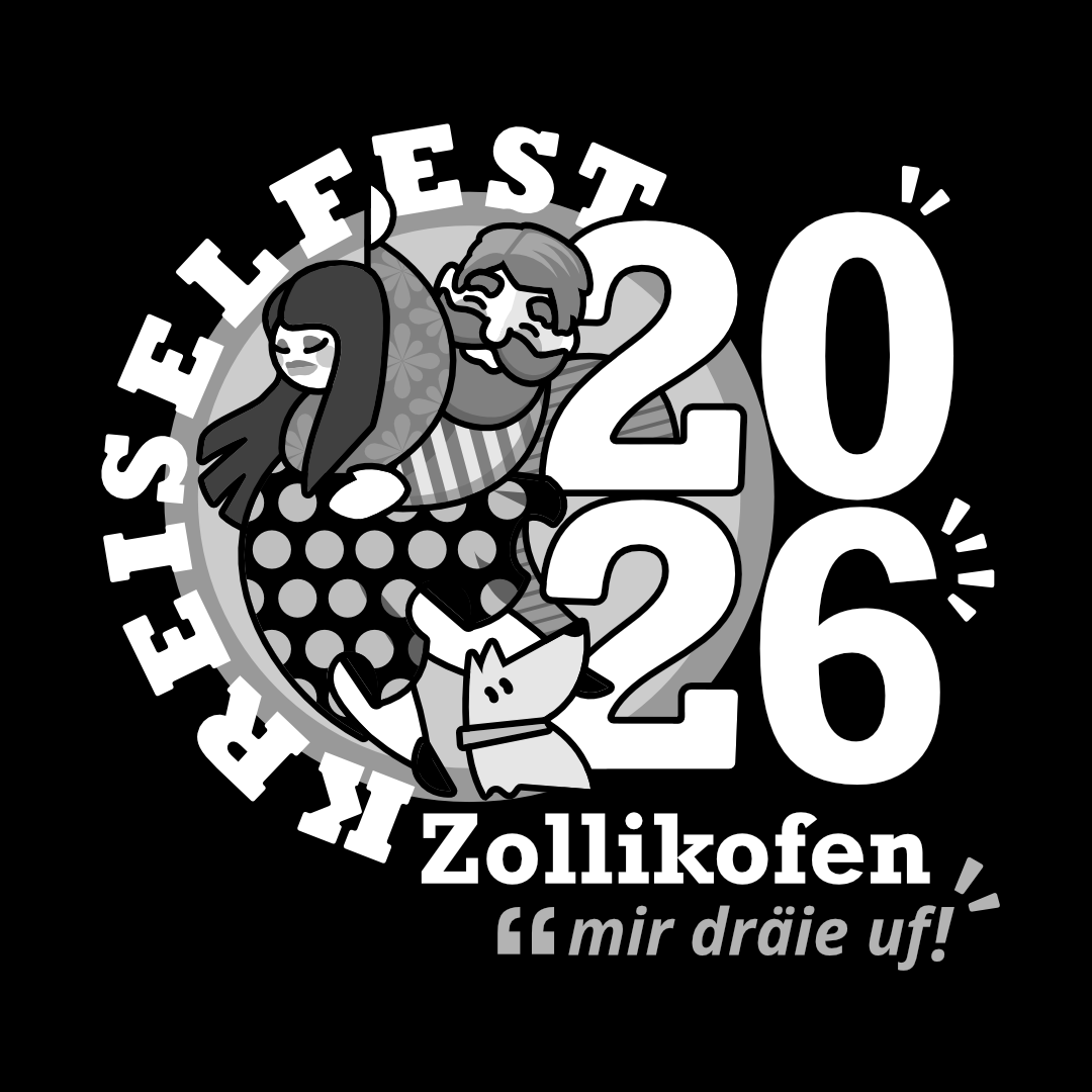
This is the original “last version” finished after 14 internal updates and 2 external reviews. The logo was built using a circle ( Kreis ) as base geometry. From that on, all the line work has some sort of bend or circular aspect, leaving almost no straight lines or sharp angular curves. This also helps to give a more human touch. The logo was designed for the eyes of the viewer to “dance° together withing the form and elements. It might start form the top, going down with the line from the hand of the lady, then your eyes slides to the dog, and suddenly is pushed to the right to the big numbers, then it goes back to the man and to the name. People will certainly spend more time than usual reading then logo and discovering the detailed subtle textures. All done in a flat color palette and design for all-ages target audience.
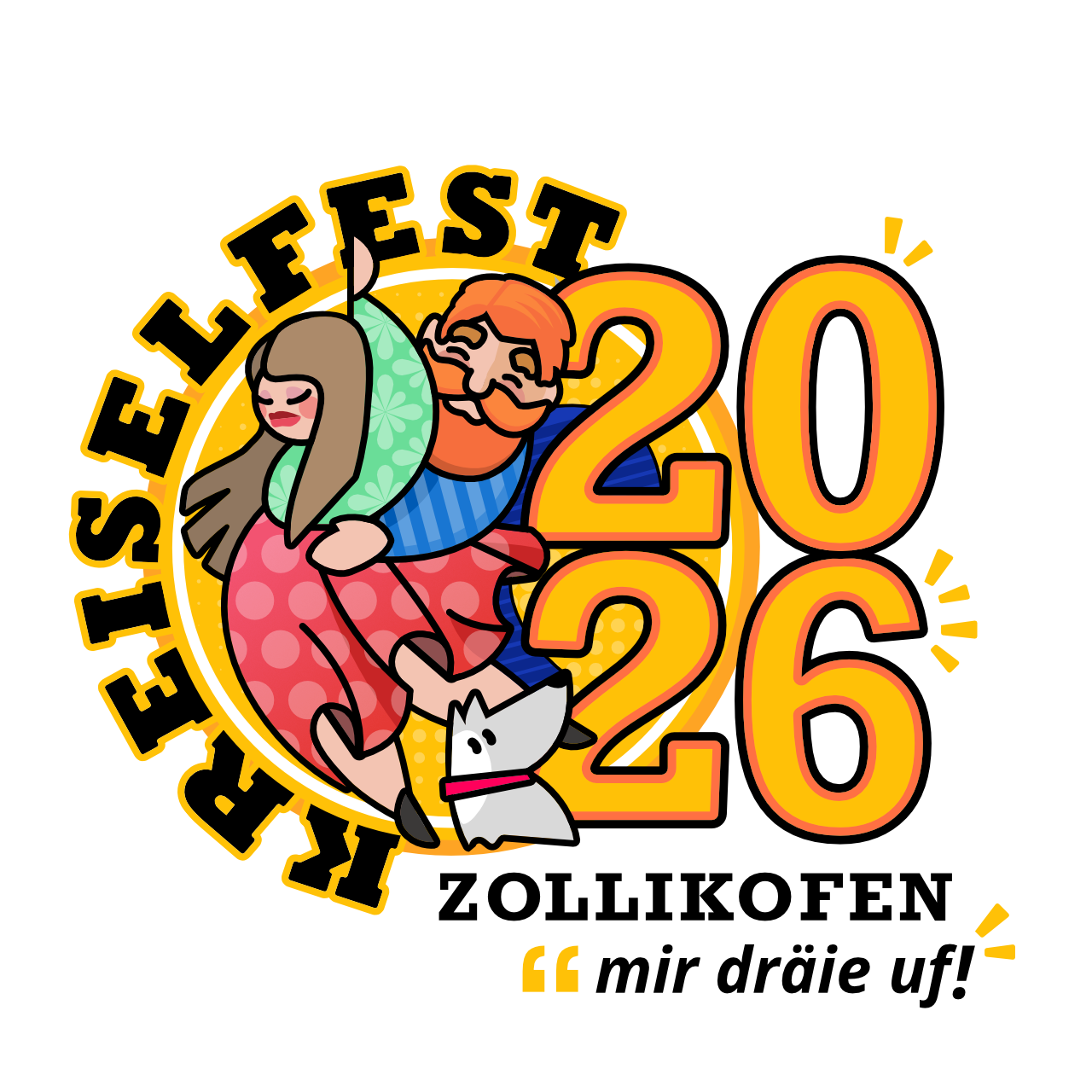
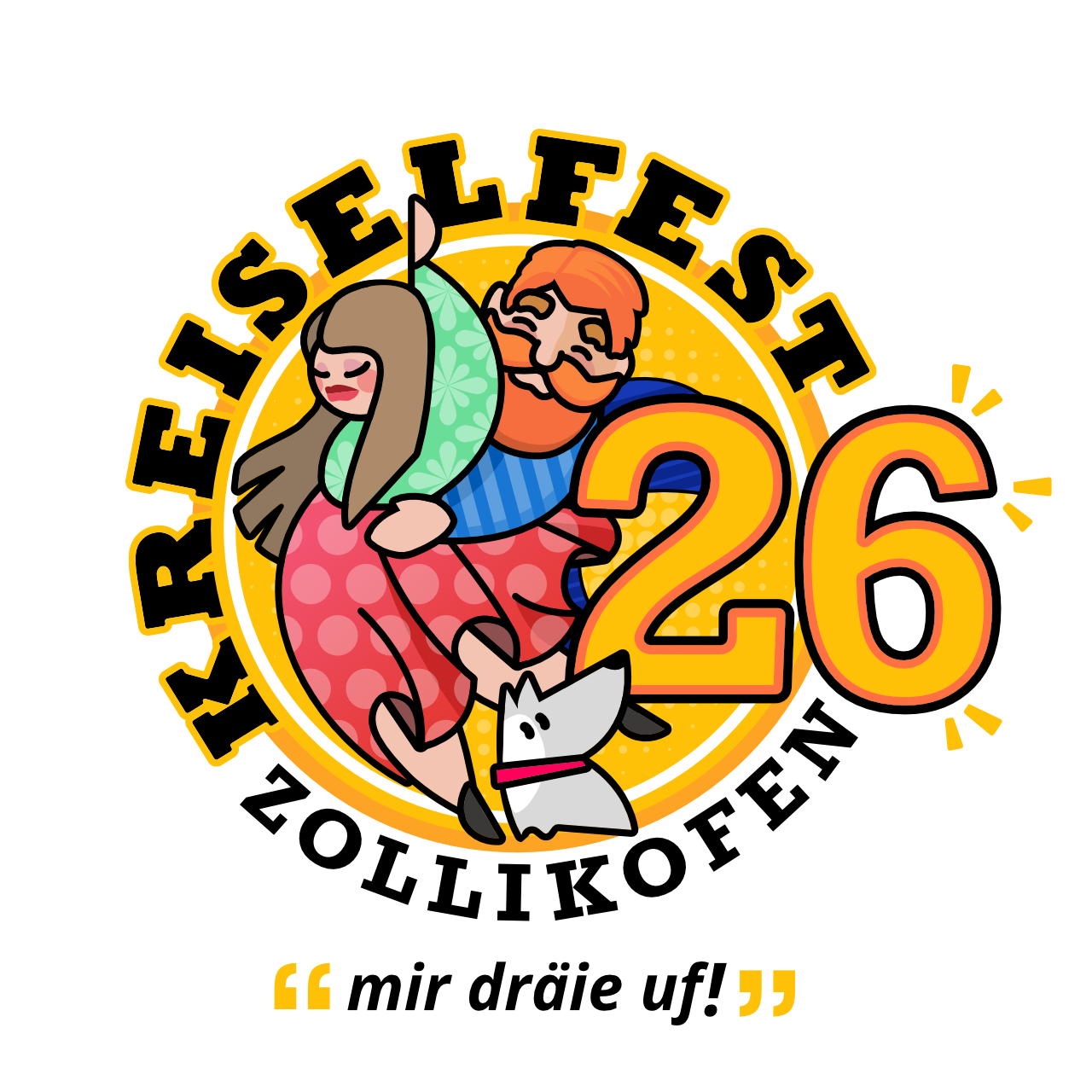
↑ Color version / Original
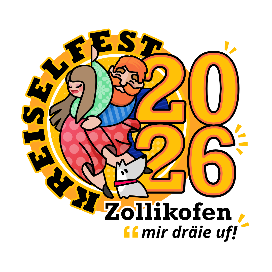
↑ Color version / Heavy Circle
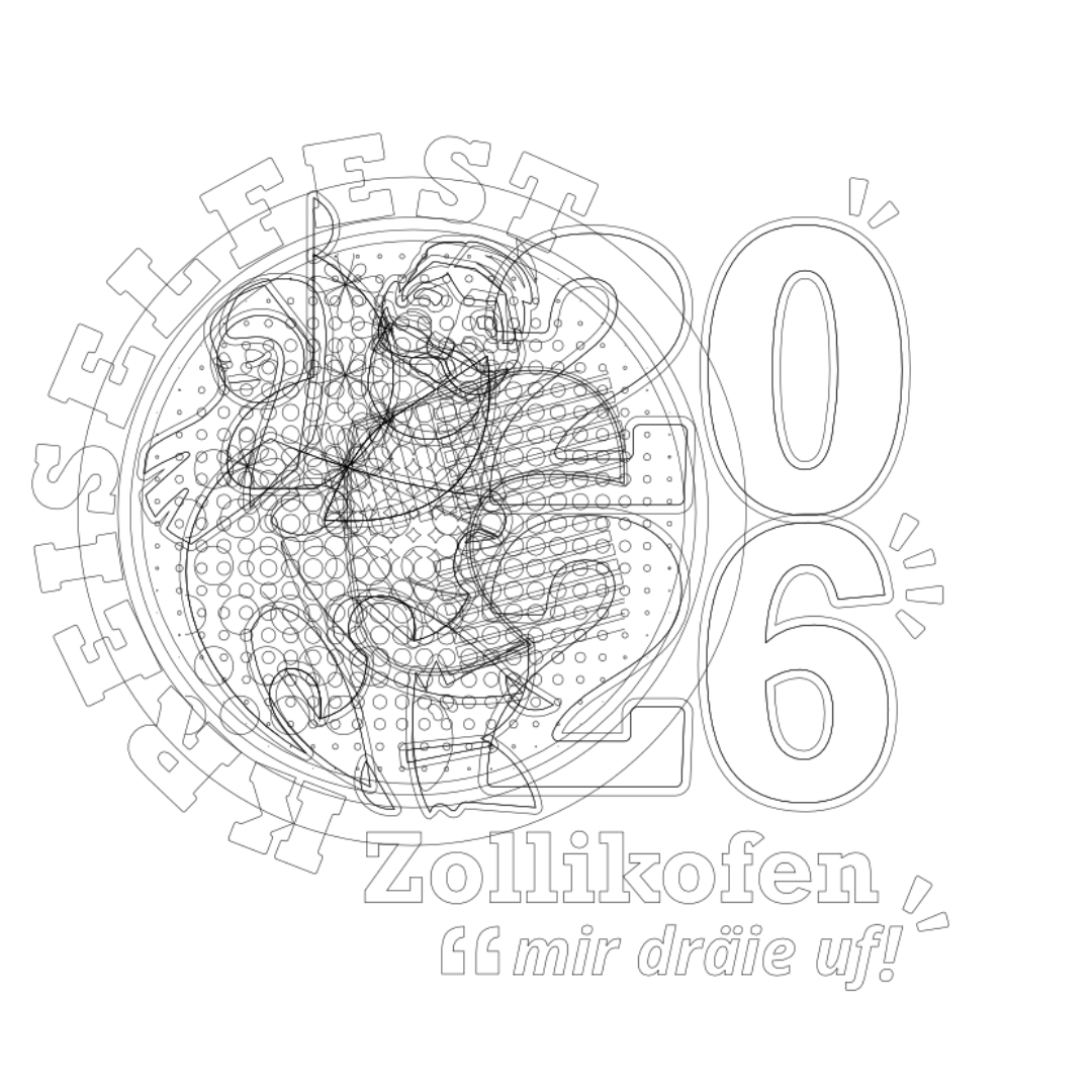
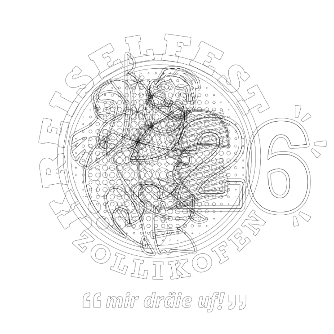
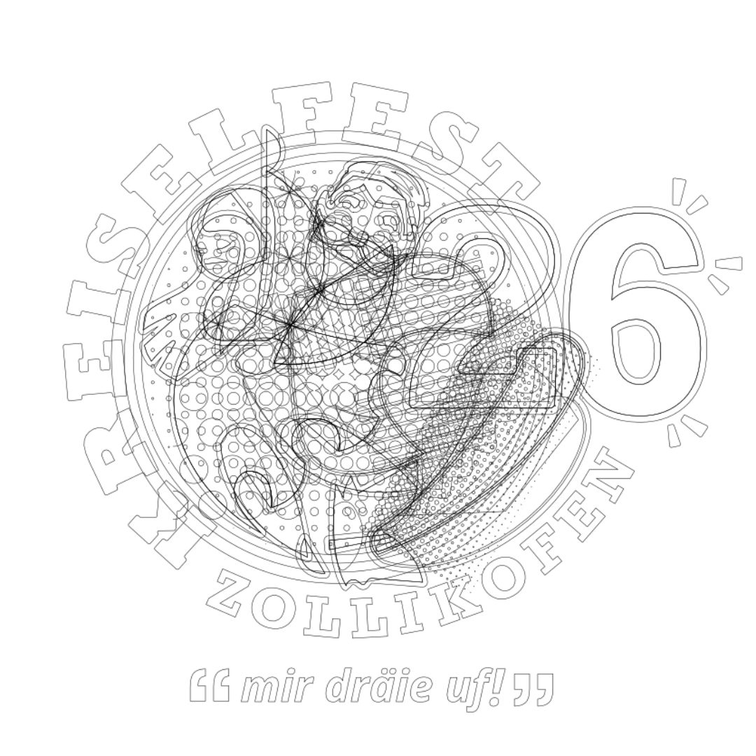
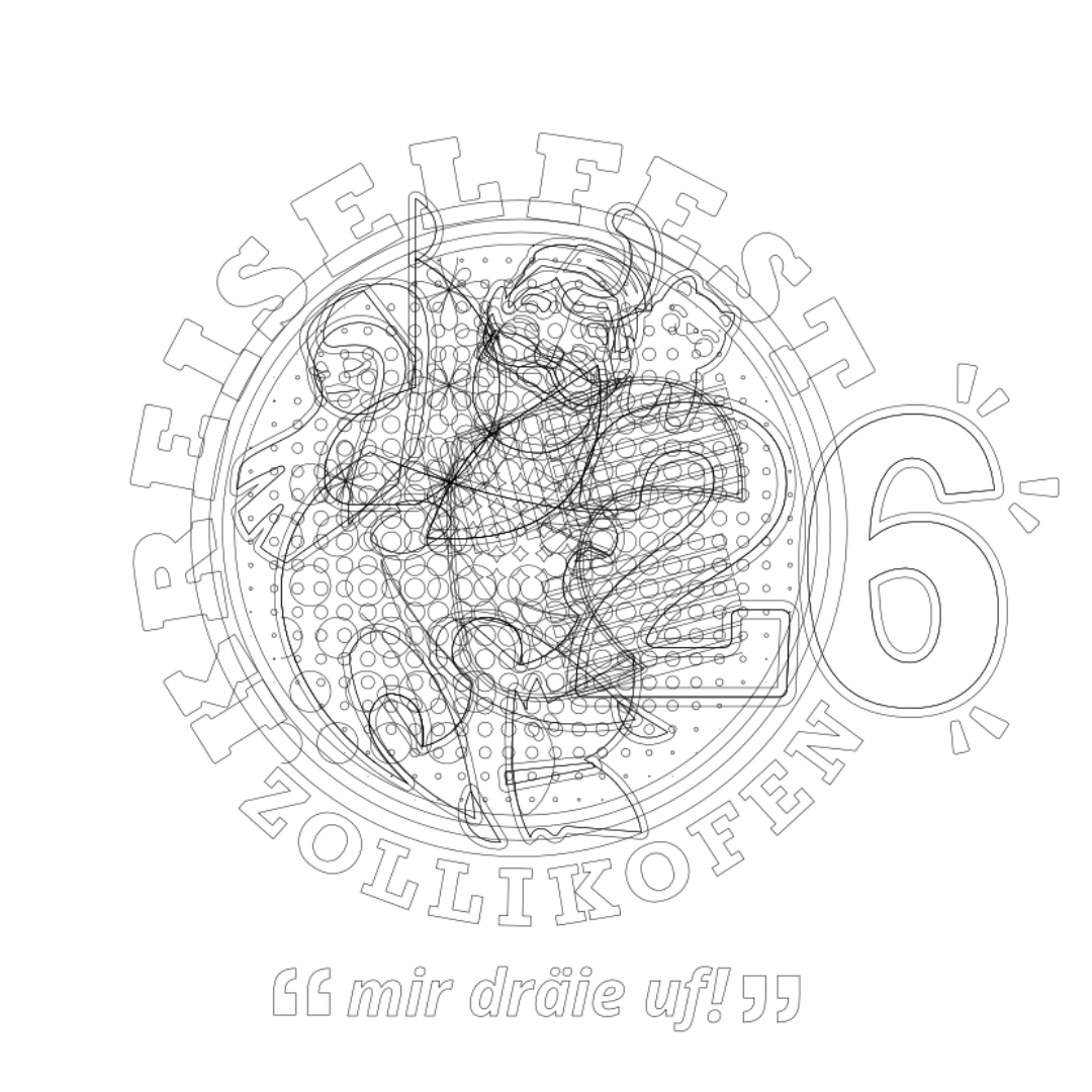
↑ Outlines
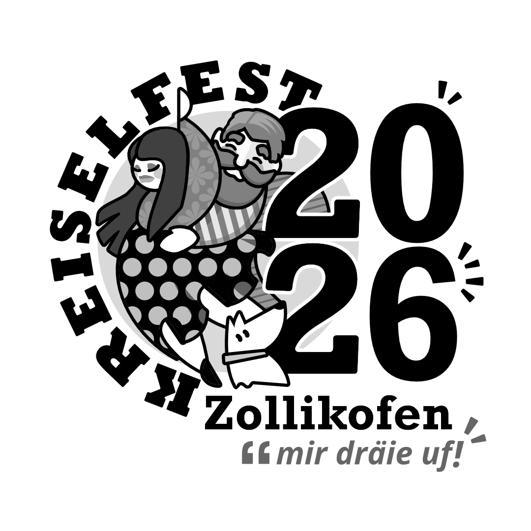
↑ B/W Positive
↑ B/W Negative
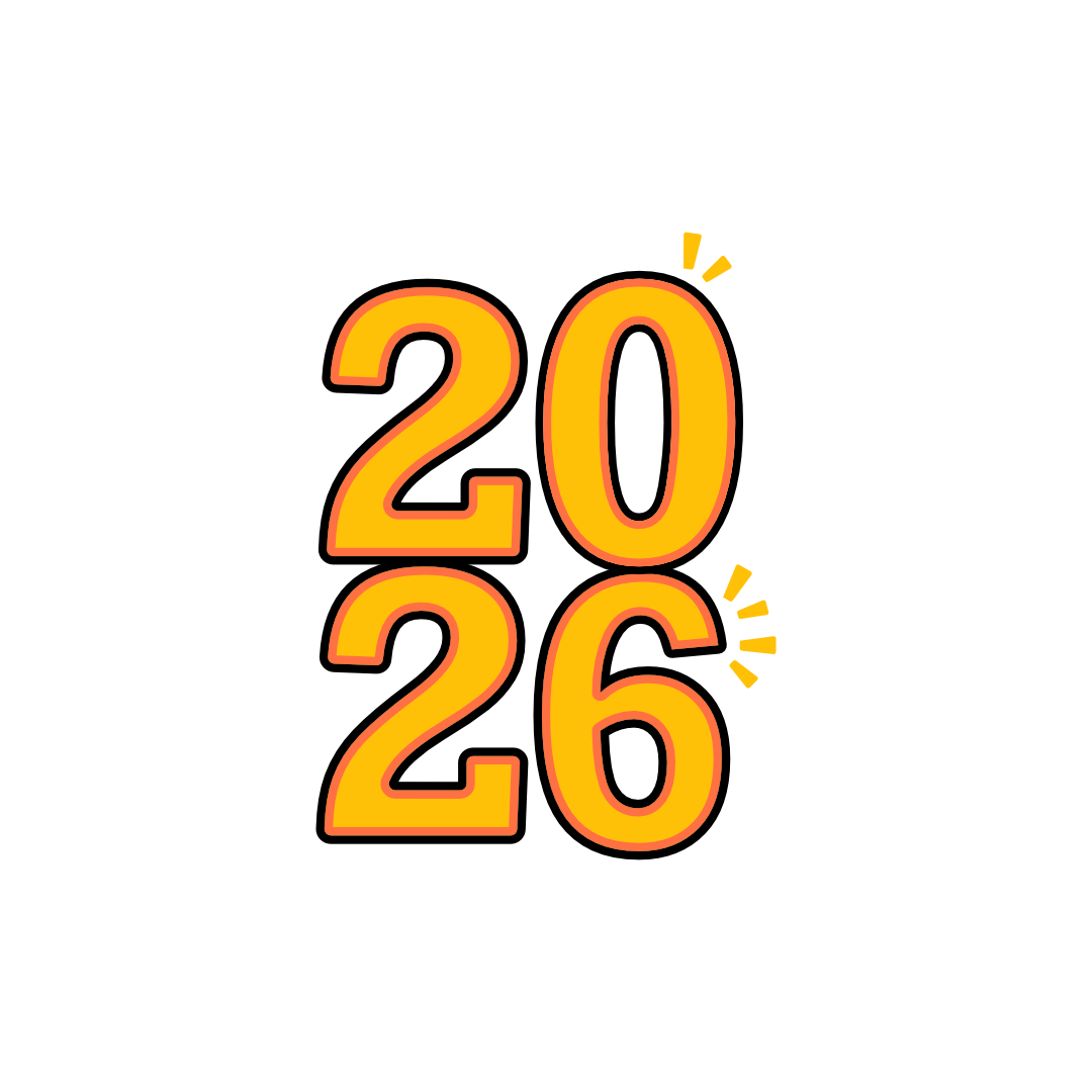
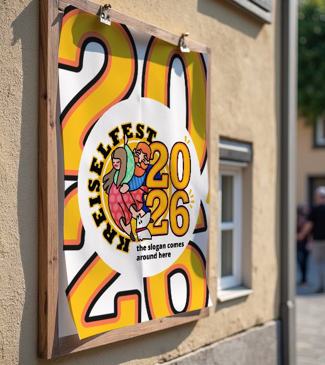
This is a leaner and cleaner version, with emphasis on “26” itself. The composition has movement and the weight is more centered distributed. It favours readability, even from a distance.
↑ Color version
↑ Outlines
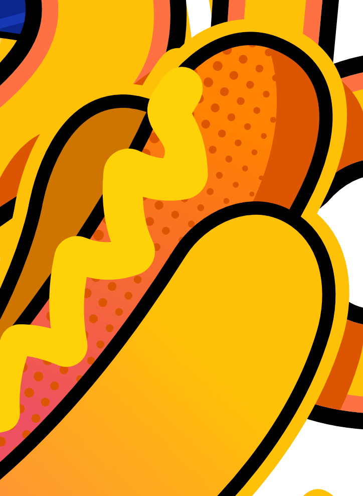
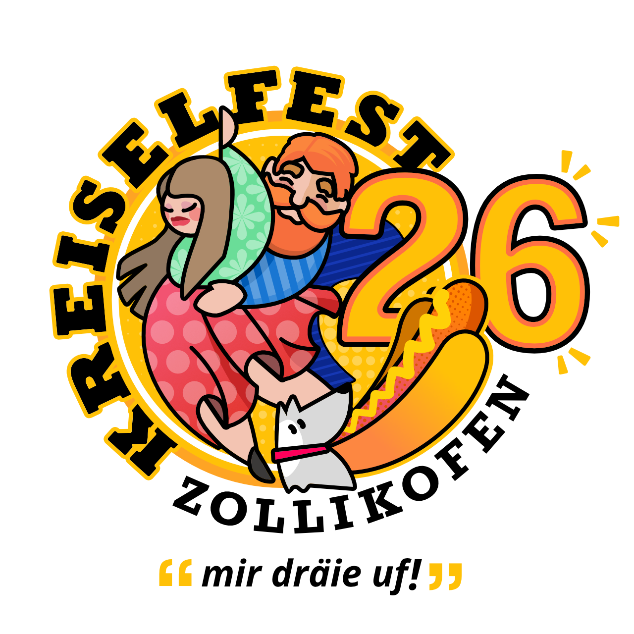
This version features one food element, the Hot Dog, the most recognizable fast food at street parties, food trucks, food tents and similar facilities worldwide. The yellow mustard, besides being one of the official colors, adds a stronger feeling of some sort of bratwurst that traditionally is served with “Senf”. – This version is the authors choice.
↑ Color version
↑ Outlines
This version features one food element, the Barbecue Stick, that stacks all the official colors in the front plane. It might be visually crowded, but gives the viewer a sense of diversity since it does not really needs to be understood as meat, but rather “something” colorful and for all-tastes. Here, the dog seems to be looking to the Barbecue Stick, with a special interest.
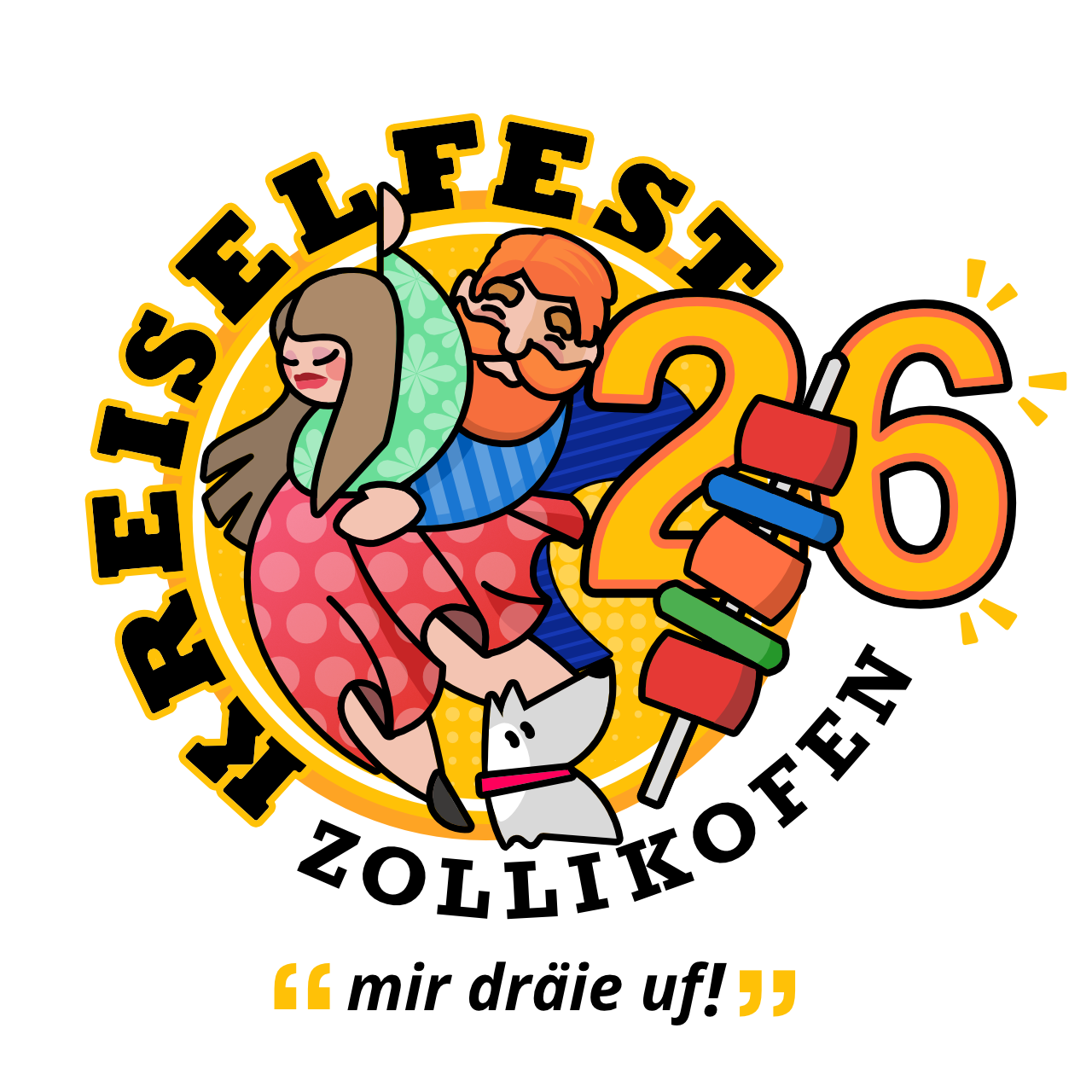
↑ Color version
↑ Outlines
This version is the most playful version available and depicts humans and pets in equal proportion. For the audience that consider pets as their child, this is a good choice. There are “dog people” and there are “cat people”, and this logo targets both. In a silly way, the dog is looking to the cat, as the cat is enjoying the movement and patting the “26”. It’s silly, it’s fun, it’s for all-ages, it’s cute and the elements seem not be in a hurry for the party to end.
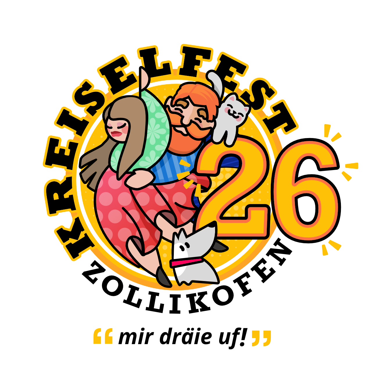
↑ Color version
↑ Outlines